
Table of Contents
Most kitchens do not fail because the owner picked the wrong shade of paint. They fail because the shape of the room and the colours in it are fighting each other. I learned that the hard way in a rented flat where the walls were a cold, blue-white, the cabinets were a yellowish oak, and the one pendant light hung so high it lit nothing but the middle of the floor. Nothing in that kitchen was broken. It just never looked right, and nobody wanted to linger in it.
These ideas for a kitchen start from a different place. Forget, for a minute, what you think a kitchen is supposed to look like, and look at the room you actually have: where the light falls at breakfast, which wall you face when you cook, how big the room feels when two people are in it. Layout comes first, colour second, and the small decorative details last. Get that order right and even a modest kitchen can look considered rather than accidental.
This guide sticks to layout, colour and decor. It covers the five layouts that suit most homes, the old work-triangle idea and why it still matters, colour palettes and how daylight changes them, cabinet finishes, backsplashes, lighting, flooring, hardware, and the finishing touches that make a kitchen feel like a room rather than a workspace. No renovation is assumed. Plenty of these ideas for a kitchen work with paint, a new faucet, or a Saturday spent swapping hardware and hanging art.
Ideas for a Kitchen: Start With the Layout, Not the Paint Colour
Paint is the easiest thing to change and the worst place to start. A colour that looks wonderful in a wide, sunny kitchen can look gloomy in a narrow one, and a layout that forces you to walk around an island every time you cross the room will annoy you long after you have stopped noticing the paint. So walk the room first. Stand where you cook, where you eat, and where you come in with shopping bags. Notice the doorways, the window, and the spot where everyone naturally gathers. That traffic pattern is your layout, whether you planned it or not.
The five layouts below cover almost every home. None of them is objectively best. A galley that suits a city flat would feel cramped in a farmhouse, and an island that looks generous in an open-plan house would swallow a small kitchen whole. The trick is matching the shape to the room and to how you actually live in it.
The galley kitchen: two runs, one clear walkway
A galley kitchen has two parallel runs with a walkway between them. It gets a bad reputation because people picture a dark corridor, but a well-lit galley is one of the most pleasant kitchens to cook in. Everything is within a step or two, and the room has a natural rhythm: one side for cooking, the other for preparing and serving.
What makes or breaks a galley is light and colour. Dark cabinets on both sides close the room in, so if you love a deep green or navy, use it on one run only and keep the other run pale. A light backsplash, a mirror or glossy tile on one wall, and a runner rug in a warm tone all help the narrow shape feel like a design choice rather than a compromise.
Keep the walkway visually clear at eye level too: tall, solid cabinets on both sides up to the ceiling can feel like a tunnel, while a mix of closed cabinets and open shelving on one side lets the eye travel and the room breathe.
The L-shaped kitchen: the flexible all-rounder
An L-shaped kitchen runs along two adjoining walls, leaving the rest of the room open. It suits open-plan living because the open corner flows naturally into a dining table or a sitting area, and it gives you a long, unbroken stretch of worktop along at least one wall. If your kitchen opens onto another room, this is usually the layout to look at first.
The corner itself is the interesting part. Some people love a corner sink with a window above it; others prefer the corner left for a tall, handsome cabinet in a contrasting finish that anchors the whole room. Either way, treat the corner as a feature rather than a dead spot. A different cabinet colour there, a piece of art on the wall above, or a plant on the worktop can turn the bend of the L into the visual centre of the room. The long arm of the L is also the best place for a run of open shelving, where a few beautiful bowls and a stack of cookbooks become part of the decor.
The U-shaped kitchen: three walls, one cocoon
A U-shaped kitchen wraps around three walls, which gives you the most wall space of any layout and a feeling of being properly inside the room. Cooks who like everything close at hand tend to love it. The risk is that three walls of cabinets can look heavy, especially if every door is the same colour and finish.
The fix is contrast. Try a darker colour on the base cabinets and a paler one above, or a wood finish on one wall and painted cabinets on the other two. A patterned backsplash on the wall you face most often breaks up the run and gives the room a focal point. In a U-shaped kitchen, lighting matters more than in any other layout, because the middle of the U can end up shadowed: a pendant over the centre, or a row of small lights under the upper cabinets, keeps the middle of the room as bright as the edges.
The island kitchen: a room within a room
An island is the layout feature everyone asks about, and the one most often squeezed into a room that cannot carry it. An island works when there is comfortable space to walk all the way around it without sidestepping. When that space exists, an island does something no other layout can: it creates a gathering spot in the middle of the room, a place where someone can sit with a coffee while someone else cooks, facing each other instead of a wall.
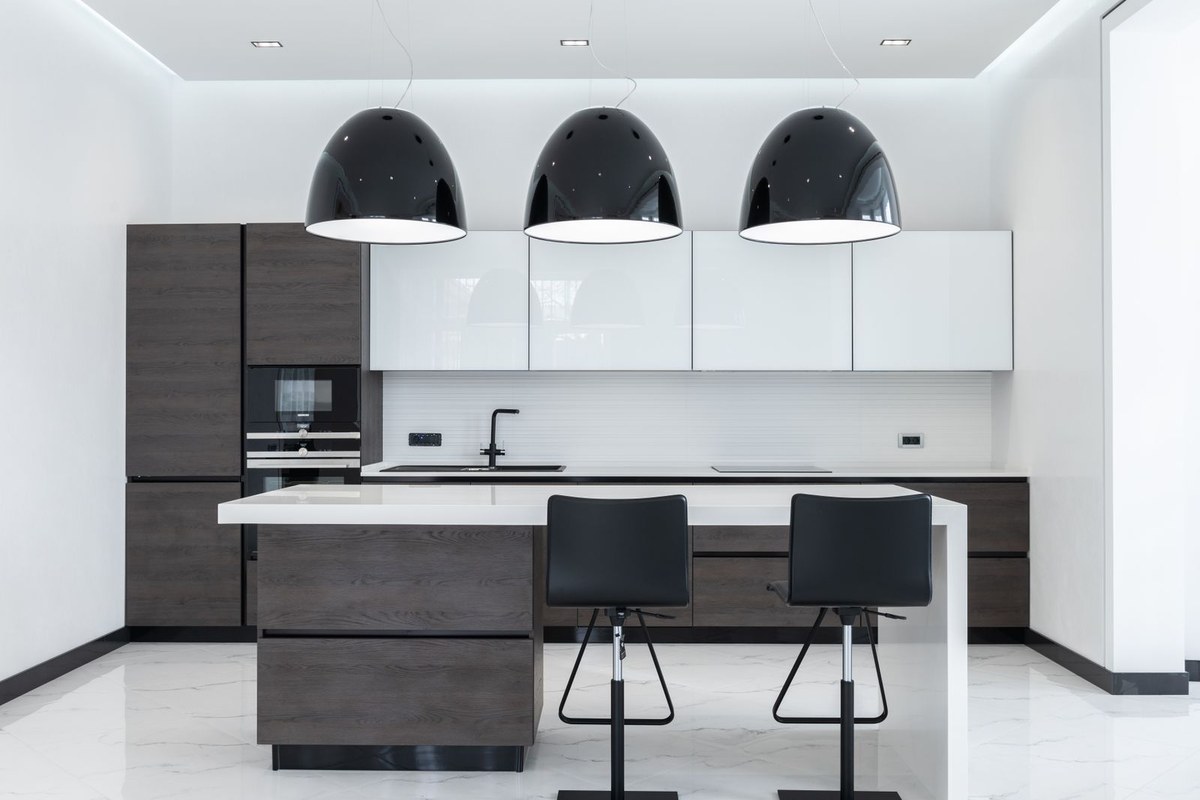
Decor-wise, the island is your chance to be bold. A contrasting colour on the island alone — deep green against cream cabinets, walnut against white, charcoal against pale grey — reads as intentional in a way that painting every cabinet the same bold colour sometimes does not. A waterfall edge, where the worktop material runs down the side of the island to the floor, looks expensive and modern.
Bar stools matter here more than people expect: their colour, material and height set the tone of the whole room, so choose stools you actually like looking at, not just sitting on.
The peninsula kitchen: the island for smaller rooms
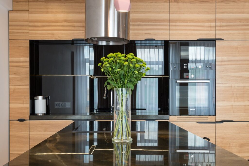
A peninsula is an island attached at one end to a wall or a run of cabinets. It gives you the social feeling of an island — a place to sit, a surface that faces into the room — without needing floor space on all four sides. For many homes, especially flats and smaller houses, it is the sensible version of the island dream.
Because a peninsula is partly a room divider, its outward face is on show from the living area. That face deserves the same attention as the front of the cabinets: panelled detailing, a contrasting paint colour, or a beautiful wood finish all work. A pair of pendant lights over a peninsula marks it as a destination rather than an afterthought, and a row of stools along the outer side turns it into the spot where breakfast actually happens.

The Work Triangle: Ideas for a Kitchen That Feels Easy to Move Around
Designers have talked about the work triangle for decades, and while kitchens have changed — we eat in them, work in them, and gather in them far more than we used to — the basic idea still holds. Picture three points: the sink, the cooking surface, and the refrigerator. Draw lines between them and you get a triangle. When that triangle is compact and unobstructed, moving between the three points feels natural. When it is stretched or blocked, every meal feels like a hike.
The National Kitchen and Bath Association’s planning guidelines, summarised in a guide to the NKBA kitchen planning guidelines, put numbers on the idea: the three legs of the triangle should total no more than 26 feet, with each leg between 4 and 9 feet, and no leg should cross an island or peninsula by more than 12 inches.
Those are guidelines, not building rules, and your local code always wins where the two differ — but they are a useful sanity check before you move anything. A work aisle of at least 42 inches for one cook, and 48 inches where two people cook together, is the same kind of yardstick: generous enough to pass someone without turning sideways.
You do not need to measure your kitchen with a tape measure to use the idea. Just notice where you walk. If you cross the main path through the house to get from the fridge to the sink, the triangle is fighting the traffic. If a tall cabinet sits between the cooker and the sink, the triangle is interrupted. Small decor decisions follow from this: keep the sightlines between the three points open, avoid hanging a huge pendant where it blocks the view across the island, and let the busiest path through the room stay visually calm rather than dressed up as a display area.
Colour Palettes: Ideas for a Kitchen That Suits Its Light
Colour is where most kitchen makeovers go wrong, and the culprit is almost always light. The same sage green looks fresh in a south-facing kitchen and muddy in a north-facing one. The same warm white looks creamy under morning sun and grey under a cool LED. Before you commit to a colour, paint a large swatch — a piece of board, not a tiny chip — and prop it in the kitchen for two days. Look at it at breakfast, at midday, and in the evening under the lights you actually use.
Current kitchen colour trends lean warm. Stark, cold white kitchens are giving way to warm whites, mushroom, clay, sage, and deep greens, with bold accents of navy, burgundy, and terracotta showing up on islands and single walls. That shift suits most homes, because warm tones flatter wood floors, brass hardware, and the food itself. But trends are a starting point, not an instruction. A kitchen you love in a colour you chose for your light will outlast any trend cycle.
How light changes colour through the day
North-facing kitchens get cool, steady light that makes warm colours look calmer and cool colours look colder. In a north-facing room, a warm white or a soft cream on the walls, with wood tones and brass to warm it further, usually beats a blue-grey. South-facing kitchens get strong, warm light that can wash pale colours out and make bold colours glow; here a deeper green or navy holds its character beautifully, and a crisp white looks fresh rather than stark.
East-facing kitchens are bright in the morning and softer later, so a colour that looks good at breakfast matters most. West-facing rooms warm up dramatically in the evening, which is flattering for terracotta, ochre, and warm wood.
Artificial light changes colour again. Warm bulbs around 2700K make creams and wood look golden; cooler bulbs make the same room look clinical. If you are choosing a paint colour, check it under the bulbs you will actually live with, not just under the shop lights. This one habit — swatch in the room, under your lights, at different times — prevents more regret than any other decorating advice in this guide.
Five palettes that work in real kitchens
Warm white and walnut is the safest beautiful combination: warm white walls and upper cabinets, walnut or oak on the island or lower cabinets, brass hardware, and a marble-look worktop. It suits traditional and modern homes alike and never fights the food or the light.
Sage and cream is softer and slightly more old-fashioned in the best way. Sage cabinets with cream walls, a buttery worktop, and black or bronze hardware feel calm and lived-in. It pairs beautifully with plants, which is handy, because a sage kitchen with a trailing plant on a shelf looks finished with almost no effort.
Navy and brass is the bold classic. Navy cabinets, a pale worktop, brass handles and faucet, and a light backsplash give a kitchen a tailored, almost formal feel. It works best in rooms with good daylight or strong lighting, because navy needs light to show its depth rather than reading as black.
Charcoal and pale wood is the modern option: charcoal lower cabinets or a charcoal island, pale wood uppers, white walls, and matte black hardware. The contrast is striking without being loud, and the pale wood keeps the charcoal from feeling heavy.
Terracotta and cream brings warmth to cooler rooms. Terracotta on an island or a single wall, cream elsewhere, warm wood floors, and copper or brass accents make a kitchen feel sunny even on a grey day. It is a palette that photographs beautifully and, more importantly, feels good to stand in.

Cabinet Finishes and Colours: The Decor Decision That Sets the Tone
Cabinets cover more wall area than anything else in the kitchen, so their finish and colour set the tone of the whole room. Painted cabinets in a satin or eggshell finish look crisp and are easy to wipe, while wood finishes — oak, walnut, ash — bring grain and warmth that paint cannot copy.
Shaker-style doors, with their simple framed panels, suit almost every home. Flat, handleless doors look sleek and modern. Beaded or panelled doors lean traditional. The door style matters as much as the colour: a navy Shaker kitchen and a navy flat-front kitchen are two very different rooms.
Two-tone cabinets are the easiest way to add depth without adding colour chaos. The usual recipe is darker below and lighter above, which grounds the room while keeping the upper half airy. A contrasting island is the bolder version of the same idea.
If you are repainting rather than replacing, two-tone is also the forgiving option: paint the island or the lower cabinets in your bold colour, keep the rest pale, and you get the drama with half the commitment. Matte finishes hide fingerprints and look soft and contemporary; gloss finishes bounce light around a small kitchen but show every mark. In a busy family kitchen, a satin finish between the two is usually the honest choice.
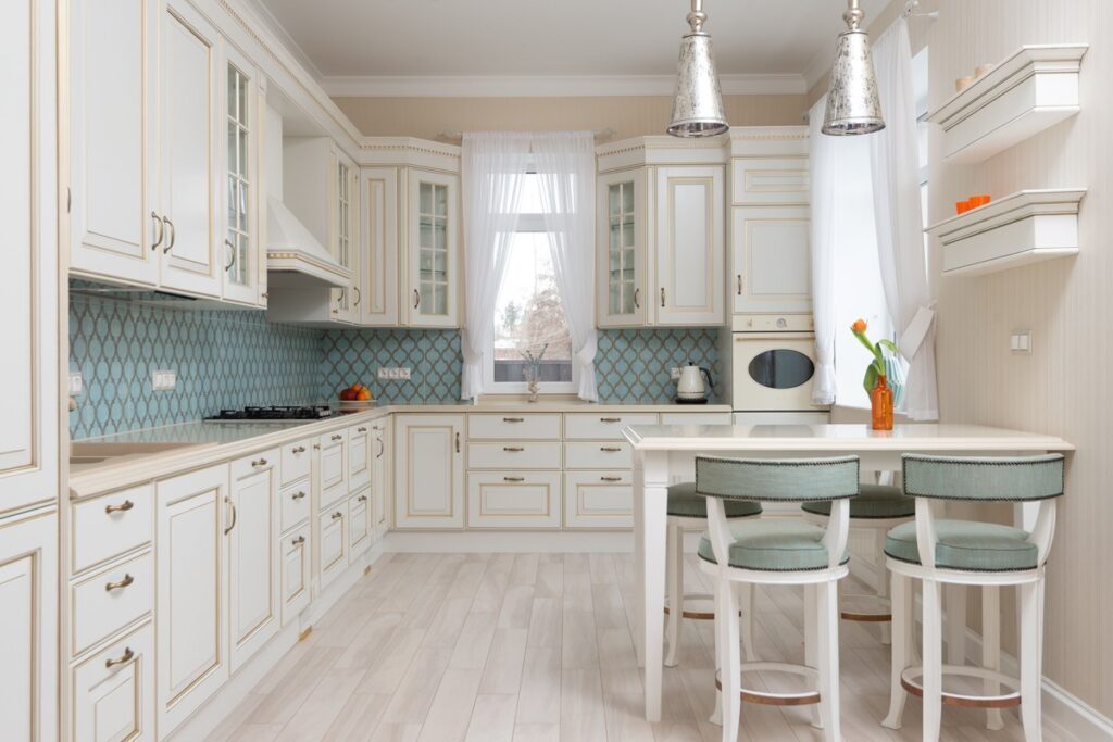
Glass-fronted upper cabinets deserve a mention because they change how a kitchen feels. A run of glass doors breaks up a wall of solid cabinets, lets light through, and turns a few beautiful pieces — coloured glass, white bowls, a collection of mugs — into decor. They work best on one run or one section rather than everywhere, and they look best when what is behind the glass is genuinely pretty. If the thought of that makes you nervous, a single glass-fronted cabinet as an accent gives you the effect without the pressure.

Backsplashes: The Small Surface With an Outsized Effect
A backsplash is a small area, but it sits exactly at eye level when you cook, so it punches far above its size. It is also the place where you can afford to be playful, because retiling a backsplash is a weekend job compared with replacing cabinets. Subway tiles in a warm white are the classic for a reason: they suit every cabinet colour, they reflect light, and they never date. Laid vertically instead of horizontally, the same tile looks taller and more modern. Laid in a herringbone pattern, it looks considered and a little luxurious.
Handmade-look tiles, with slight variation in colour and surface, add texture that flat tiles cannot. Zellige tiles in soft greens and blues are everywhere right now, and they suit warm wood and brass beautifully. A full-height backsplash, running from the worktop to the underside of the upper cabinets or even to the ceiling behind the cooker, makes a stronger statement than a short strip and can make a small kitchen feel taller. A slab backsplash in the same material as the worktop — marble-look, quartz, or stone — looks seamless and expensive, and it has the practical bonus of fewer grout lines to look at.
Colour-wise, the backsplash is where your palette comes together. If your cabinets are bold, a quiet backsplash in a pale neutral lets them shine. If your cabinets are pale, the backsplash is the place for pattern, colour, or texture. One rule of thumb: pick one star per wall. A bold backsplash and bold cabinets and a bold floor on the same wall compete; a bold backsplash with calm cabinets sings.
Lighting Layers: The Difference Between a Kitchen and a Showroom
If there is one idea in this guide that transforms a kitchen overnight, it is layered lighting. A single ceiling light, however bright, flattens everything: it lights the middle of the room, leaves the worktop in shadow, and makes colours look harsh. Three layers fix it.
Ambient light from the ceiling or a central fixture gives general brightness. Task lighting — strips or small lights under the upper cabinets — lights the worktop where you actually chop and read recipes. Accent lighting — pendants over an island, a picture light over art, a soft glow inside a glass cabinet — creates atmosphere and focal points.
Pendants deserve care. Over an island or peninsula, hang them low enough to feel intentional — roughly 30 to 36 inches above the worktop — and choose a size that suits the island: one large pendant over a small island, or two or three smaller ones over a long one. Glass pendants keep the sightline open in a small kitchen; solid metal or rattan pendants make a stronger style statement.
Under-cabinet lighting is the unglamorous hero: it makes the worktop usable after dark, makes the backsplash glow, and makes the whole kitchen feel warmer at night. Dimmers on every layer are worth every penny, because a kitchen at full brightness for cooking and at low light for a late glass of wine are two different rooms, and both are worth having.
Warm bulbs, again, matter. A kitchen lit at 2700K to 3000K feels welcoming; much cooler and the food, the wood, and your skin all look less appealing. If your kitchen has one cold ceiling light, swapping the bulb is the cheapest decor upgrade in this entire guide, and the effect is immediate.
Flooring Choices: The Surface You See From Every Angle
Kitchen flooring is seen from every doorway and walked on more than any other floor in the house, so its colour and pattern shape the room as much as the cabinets do. Warm wood, whether real timber or a good wood-look tile, warms up pale cabinets and suits almost every palette in this guide. Herringbone wood, in particular, adds pattern and movement without adding colour, which is why it appears in so many beautiful kitchens.
Large-format tiles in a pale stone look give a clean, modern feel and reflect light, which helps smaller kitchens. Patterned tiles — encaustic-look, terracotta, or a bold geometric — turn the floor into a feature, and they work best when the cabinets and backsplash are calm, so the floor can carry the pattern alone. Dark floors ground a light kitchen and hide marks, but they need good light to avoid making the room feel smaller. Whatever you choose, run the same flooring through into an adjoining room where you can: a continuous floor makes two rooms feel like one larger space, which is one of the simplest visual tricks in decorating.

Hardware and Faucet Styles: Small Details, Big Personality
Hardware is jewellery for cabinets, and like jewellery, it should be chosen deliberately rather than by default. Brass and aged bronze warm up pale and green cabinets; matte black suits charcoal, white, and modern flat-front kitchens; polished chrome and brushed nickel suit cool palettes and traditional rooms. Mixing metals can work — brass faucet with black cabinet pulls, for example — as long as each metal appears more than once, so the mix looks intentional rather than accidental.
Shape matters too. Long bar pulls look modern and are easy to grip; round knobs look traditional and suit Shaker doors; cup pulls on drawers lean farmhouse. If you are updating a kitchen on a budget, swapping hardware is the highest-impact small change you can make: new pulls and a new faucet can make twenty-year-old cabinets look ten years younger. The faucet itself is a style statement now, with bridge faucets and gooseneck shapes for traditional kitchens, sleek single-lever designs for modern ones, and brass or matte black finishes that tie the whole palette together. Choose a faucet you like looking at, because you will look at it every day.
Decor Touches: Open Shelving Styling, Art and Plants
Once the layout, colour, and lighting are right, the finishing touches are what make a kitchen feel personal. Open shelving is the most debated of these, and the secret is restraint. Style a shelf the way you would a picture: a few beautiful bowls stacked, a small plant trailing, a stack of cookbooks in your palette, and empty space between groups. The empty space is doing work — it lets the eye rest and makes the pieces on show look chosen rather than accumulated. One or two styled shelves beat a whole wall of crowded ones.
Art belongs in kitchens more than people think. A framed print above a sideboard or on the wall at the end of a galley, a small painting leaning on a worktop, or a vintage food poster in a simple frame all make a kitchen feel like a room rather than a utility. Choose art in your palette and at a scale that suits the wall: a tiny print lost on a large wall looks like an afterthought, while one generous piece anchors the space.
Plants are the other easy win. A potted herb on the windowsill, a trailing pothos on top of a cabinet, or a large olive tree in a sunny corner softens hard surfaces and brings a living colour into the room that no paint can match. Use pots in your palette — cream, terracotta, or stone — so the plants feel part of the design rather than an addition to it.
Textiles finish the room: a runner rug in a warm pattern down a galley, linen curtains or a simple Roman blind at the window, and a couple of tea towels in your accent colour hanging where they are actually used. These are small, cheap, and changeable with the seasons, which makes them the perfect place to try a bolder colour before committing to it on a wall. The same principle that guides our bedroom decor ideas applies here: a tight palette, repeated finishes, and a few pieces you genuinely love beat a room full of unrelated purchases.
Ideas for a Kitchen in Small and Large Rooms
Small and large kitchens need the same ideas, applied differently. In a small kitchen, light colours on walls and upper cabinets, a reflective backsplash, and glass-fronted cabinets or open shelving on one run keep the room feeling open. A single bold colour — on the island, if there is one, or on one wall — gives the room character without closing it in.
Scale matters: one large piece of art rather than several small ones, a runner rug rather than a small mat, and pendant lights sized to the room rather than oversized for drama. Mirrors, used carefully opposite a window, bounce daylight deeper into the room and are one of the oldest small-room tricks for a reason.
In a large kitchen, the risk is the opposite: the room can feel empty or echoey, and the decor needs to fill the space without crowding it. Here, a bold island colour, a large piece of art, a patterned floor, and a statement pendant all earn their place.
Two seating areas — stools at the island and a table nearby — make a large kitchen feel social rather than cavernous. Darker colours, which would overwhelm a small room, come into their own here: a deep green or navy on all the cabinets, warmed by wood and brass, looks rich rather than heavy when the room has the light and the floor space to carry it. The through-line is the same in both sizes: let the layout lead, let colour follow the light, and let the decor be the layer that makes the room yours.
For the rest of the house, the same discipline pays off. Our home decor ideas guide covers how to carry one palette from room to room, and if you want the whole house to feel more polished, the ways to make your home look more expensive guide covers proportion, lighting, and restraint in detail. A kitchen that shares its palette with the rooms around it always looks more considered than one decorated in isolation.
Putting It Together: A Simple Order of Work
If you are starting from scratch, work in this order and you will avoid most expensive mistakes. First, sketch the layout and check the work triangle and the walkways. Second, choose the cabinet finish and colour, and test it in the room’s light. Third, pick the worktop and backsplash together, because they sit side by side and need to agree. Fourth, choose flooring that suits both. Fifth, pick hardware and faucet finishes that repeat somewhere else in the room. Last, add lighting layers, art, plants, and textiles. Working in that order means each decision supports the next, instead of discovering at the end that the beautiful backsplash fights the floor you already laid.
If you are refreshing a kitchen you already have, reverse the order: start with the cheapest, most reversible changes — bulbs, hardware, textiles, art, plants — and see how far they take you. Many kitchens that feel tired need only warmer light, a new faucet, and a coat of paint on the island to feel new again. Repainting cabinets is the bigger step, and it is worth doing properly: clean and prime first, use a paint made for cabinets, and live with a swatch before committing to the whole room.
Frequently Asked Questions
What are the best ideas for a kitchen with little natural light?
Choose warm whites and pale wood, a reflective backsplash, and layered lighting with warm bulbs. Glass-fronted cabinets on one run and a mirror opposite the window help daylight travel further. Avoid very dark cabinet colours on every wall in a dim room; use the bold colour on the island or one wall instead, where it adds character without darkening the whole space.
Which kitchen layout is best for a small home?
A galley or an L-shape usually suits a small home best, with a peninsula if you want island-style seating without needing floor space on all sides. The deciding factor is the walkway: leave comfortable room to move around the layout, and let the shape follow the room’s doorways and window rather than forcing a layout the room cannot carry.
How do I choose a kitchen colour that will not date quickly?
Pick a warm neutral for the largest surfaces — walls and most cabinets — and put bolder colours where they are easy to change: the island, a backsplash, textiles, and art. Warm whites, sage, and soft greys have lasted through many trend cycles, while a bold island colour can be repainted in a weekend if your taste changes.
Should the island be a different colour from the rest of the cabinets?
It often looks better that way. A contrasting island creates a focal point and lets you use a bold colour without committing every cabinet to it. The contrast works when the island colour appears somewhere else in the room too — in a stool, a piece of art, or a textile — so it reads as part of the palette rather than an accident.
What is the work triangle, and does it still matter?
The work triangle connects the sink, the cooking surface, and the refrigerator. Guidelines from the National Kitchen and Bath Association suggest the three legs should total no more than 26 feet, with each leg between 4 and 9 feet. It still matters as a sanity check on how a kitchen feels to move around in, even though modern kitchens are also used for eating, gathering, and working, which the original triangle never tried to cover.
How can I update my kitchen decor without a renovation?
Swap the bulbs for warm ones and add dimmers, change the cabinet hardware and faucet, repaint the island or one wall, add a runner rug and art, and style one or two open shelves with pieces you already love. Those changes cost far less than a renovation and, done in a single palette, can change how the whole room feels.
Good ideas for a kitchen are rarely about spending more. They are about paying attention: to the shape of the room, to the light that falls in it at different times of day, and to the colours and finishes that make you want to stay in it. Start with the layout, test your colours where they will live, layer your lighting, and finish with the details that are personal to you. The result will not look like a showroom, and that is the point. It will look like your kitchen, only better — a room that works for cooking, for gathering, and for the ordinary mornings that make up most of a life.
Leave a Reply